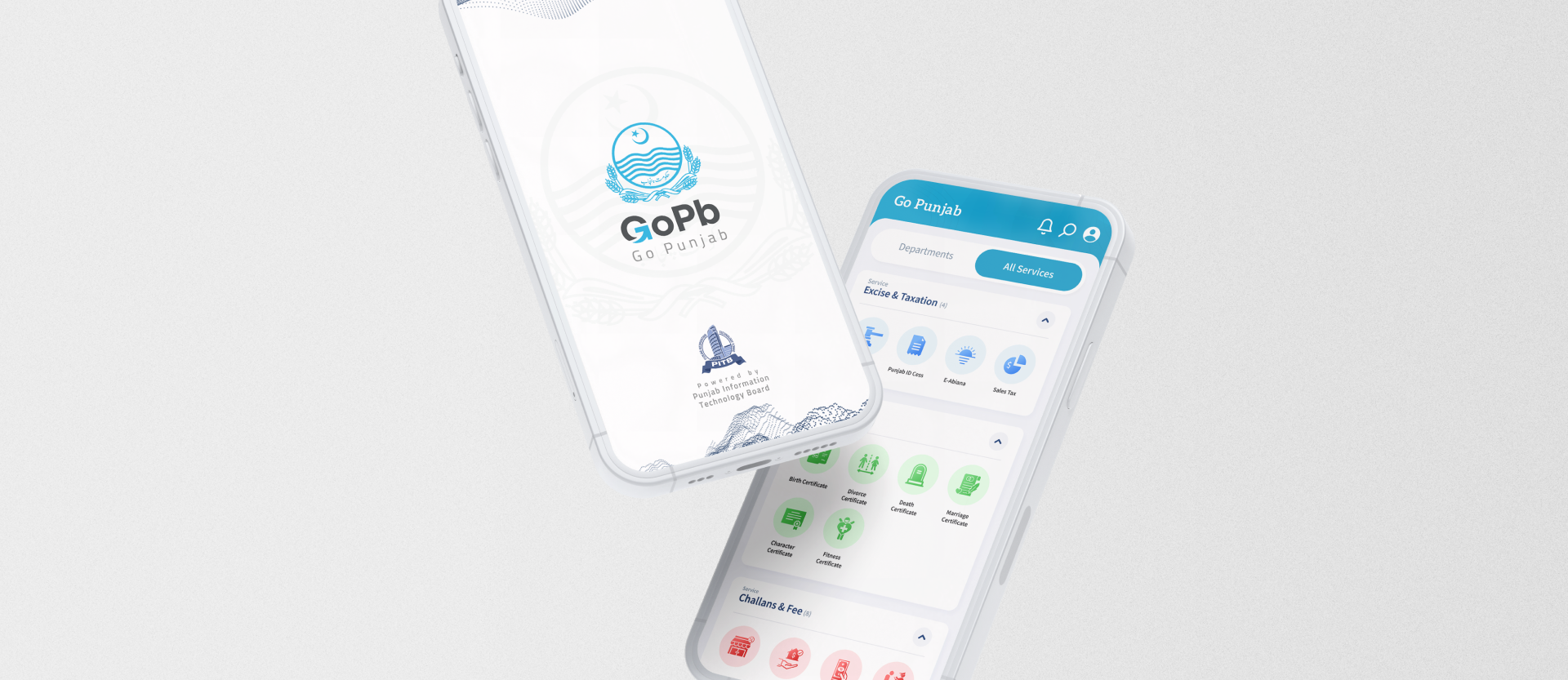
Go Punjab (GoPb) is a single digital platform that integrates citizen-facing public services on one mobile application. The platform allows for a single sign-in profile for availing all integrated services. GoPb uses existing web portals, automated services, and public facilitation platforms developed by the Punjab Information Technology Board (PITB) and integrates their services on a singular platform.
As a user and a UX designer, I faced various issues and problems while accessing public services in Punjab, such as:
App overload: Juggling multiple apps, logins, and profiles for different services.
UX inconsistency: Frustrating variations in app quality and user experience.
Information maze: Struggling to find information, pay fees, or get documents.
Offline obstacles: Navigating corruption, long queues, and bureaucratic hurdles.
These issues motivated me to devise a solution that would address the needs and pain points of the citizens of Punjab, as well as improve the efficiency and transparency of the public service delivery. We decided to create a single digital platform that would integrate all the citizen-facing public services on one mobile application, and provide a user-friendly, secure, and reliable experience for the users.
To understand the users and their context, I conducted user research using various methods, such as:
Online surveys: Online surveys to collect quantitative data from the app’s potential users were conducted. The surveys that had questions about their traits, choices, actions, and wishes for the public services and the apps helped me find the user segments, needs, and problems.
Interviews: I interviewed 20 users who used public services and apps in Punjab. The interviews gave me quality insights into the user needs, feelings, and challenges. I asked questions to get the user stories, feedback, and ideas for the app.
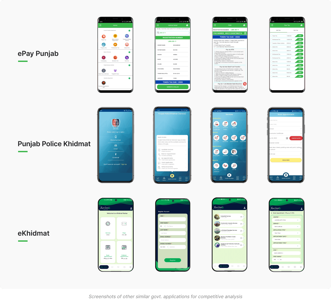
Competitor analysis: To identify the gaps, challenges, and best practices in the market, I examined the current mobile apps that provided public services in Punjab, like e-Pay Punjab, e-Khidmat, etc. I assessed their pros, cons, potentials, and risks, as well as their design, usability, and user reviews.
The survey aimed to collect information about the potential users of the app that offers public services in Punjab. The survey consisted of three sections: Demographics, Preferences, and Behaviors. The survey included questions like:
How old are you?
What is your highest level of education?
How often do you use public services in Punjab?
What do you like or dislike about using public services in Punjab?
What are your main goals or reasons for using public services in Punjab?
How do you find and access information about public services in Punjab?
How do you pay fees, obtain certificates, report incidents, or contact emergency services using public services in Punjab?
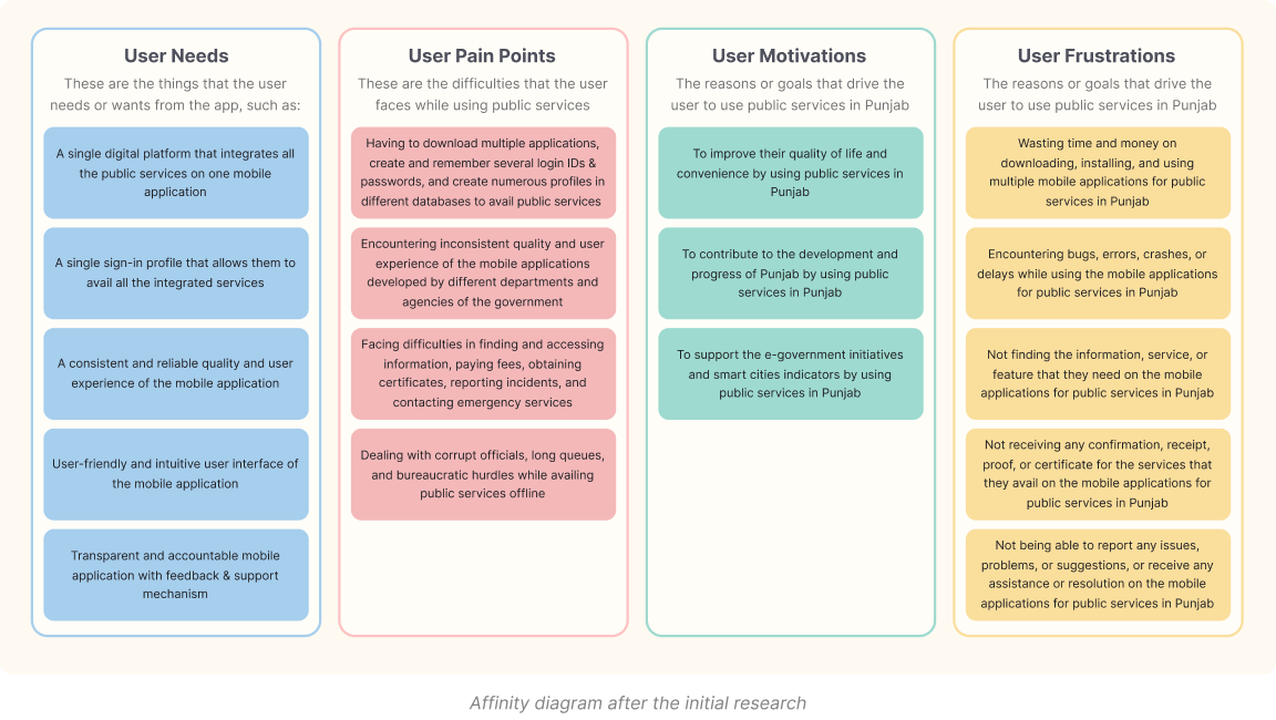
An affinity diagram is a tool to organize and cluster the user data and insights into themes and categories. The affinity diagram that I created has four main categories: User Needs, User Pain Points, User Motivations, and User Frustrations. Each category has several subcategories that represent the specific user data and insights that I collected from the user research. Here are the details of each category and subcategory:
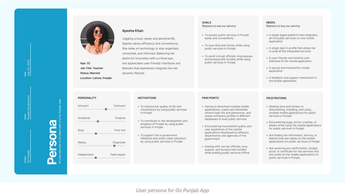
I created a persona to represent the typical user of the app. The persona included the user name, age, occupation, location, goals, needs, pain points, and motivations. The persona helped me to empathize with the user and to design the app for the user.
Goal: To obtain a character certificate from the law and order category of the GoPb app
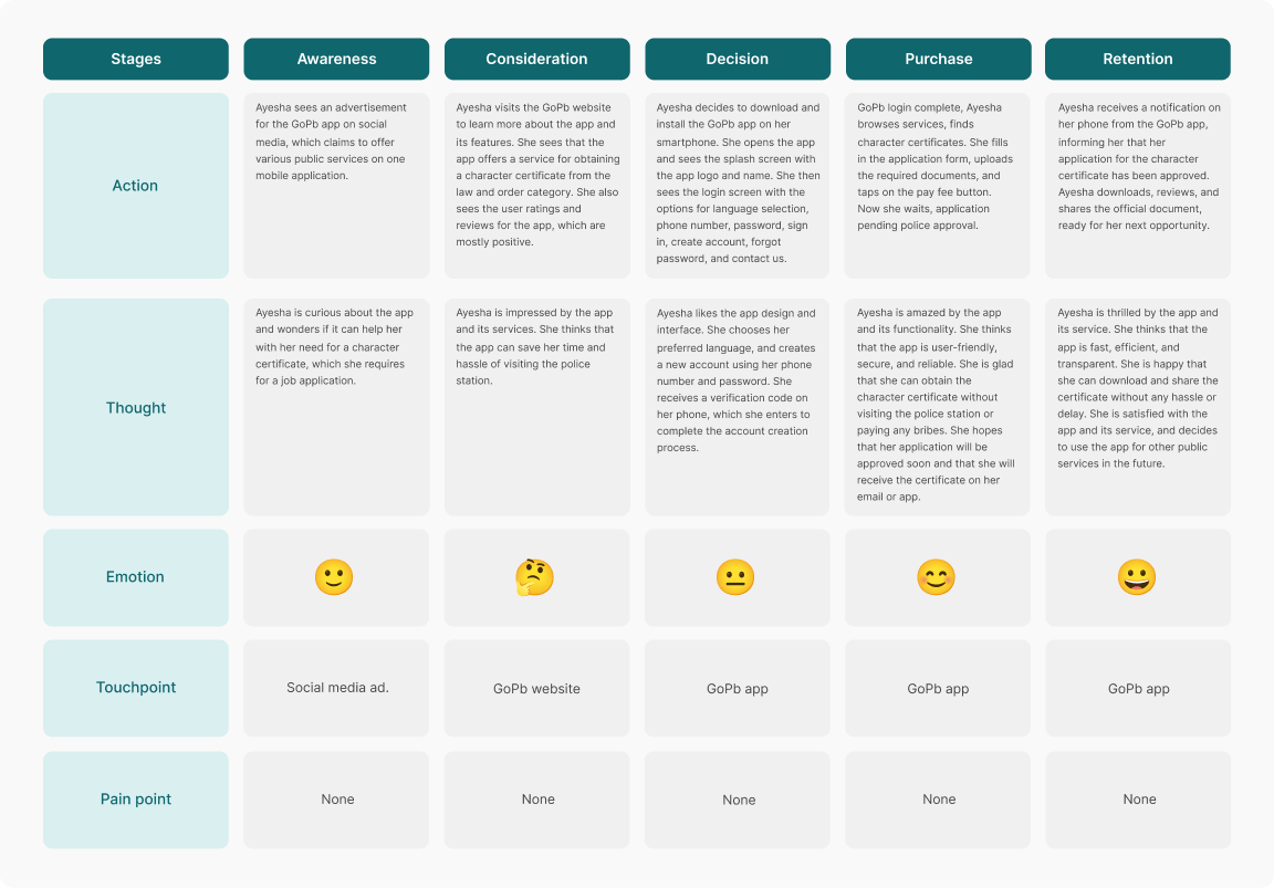
The ideation phase involved generating and evaluating ideas for the solution, developing user and service flows, and defining the scope of the services.
To generate and evaluate ideas for the solution, I used various methods, such as:
Brainstorming: I conducted brainstorming sessions with the stakeholders, such as the PITB team, the government officials, and the potential users, to generate as many ideas as possible for the app. I used the SCAMPER method to modify and improve the existing ideas, by asking questions such as:
Substitute: What can we substitute in the existing solutions to make them better?
Combine: What can we combine from the existing solutions to make them better?
Adapt: What can we adapt from other domains or contexts to make the app better?
Modify: What can we modify or change in the app to make it better?
Put to another use: What can we put to another use or purpose in the app to make it better?
Eliminate: What can we eliminate or reduce in the app to make it better?
Rearrange: What can we rearrange or reverse in the app to make it better?
Card Sorting: I gathered all the app content and features, such as services, departments, categories, information, functions and put each content and feature on a card using Maze an online card sorting tool.
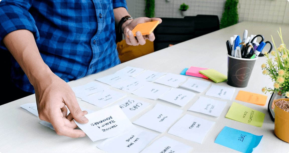
The users sorted the cards into four groups or categories, which are:
Services: This group contains the cards that represent the different types of services that the app offers, such as Payments, Certificates, Tourism, Travel & Transport, and Law & Order.
Account: Cards in this group represent the user’s personal and account information, such as Profile, Unsent Reports, and Activity History.
Support: This group contains the cards that represent the app’s support and assistance options, such as Contact Us and Feedback.
Emergency: This group contains only one card, which is Disaster and Emergency. It relates to the user’s safety and security
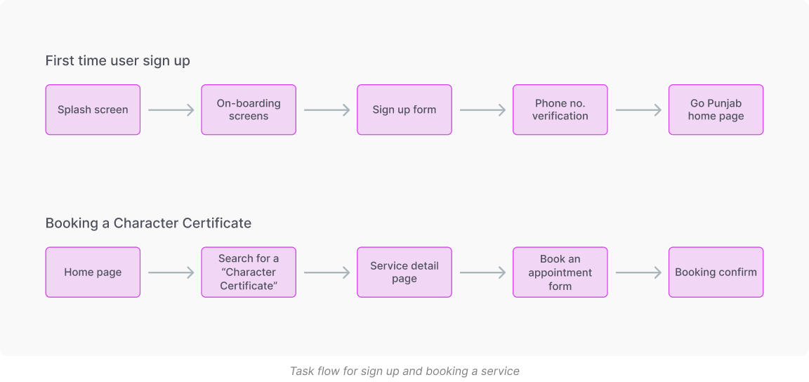
Created different task flows of users from the start till booking a service.
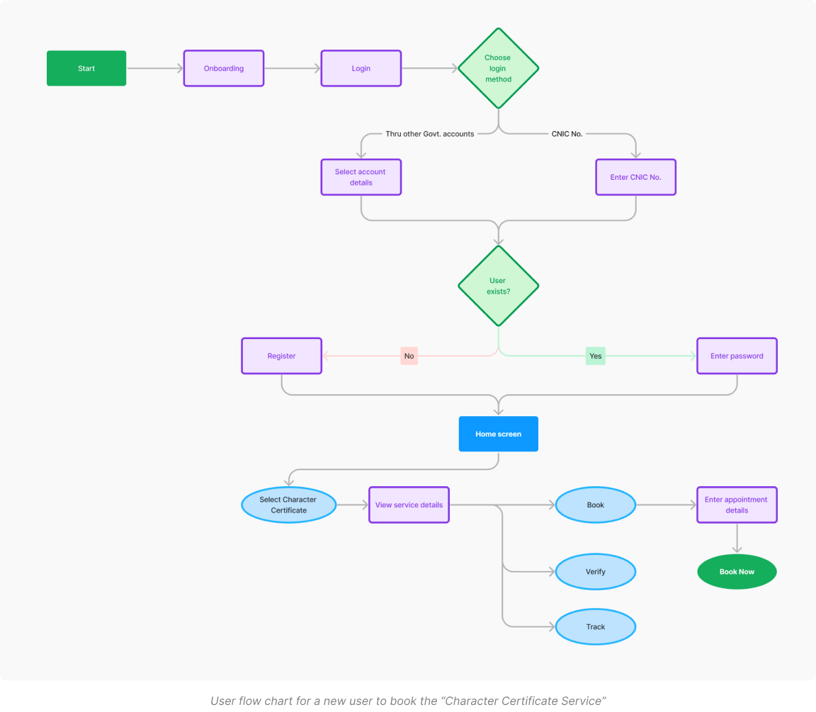
I created a user flow diagram to show the steps and paths that the user would take to complete a task or a goal using the app. I used the flowchart symbols and arrows to represent the app screens, actions, decisions, and outcomes. I created multiple user flow diagrams to cover different tasks and goals, such as signing in, availing a service, contacting a department, etc.
The design phase involved creating the high-fidelity prototypes of the app interface, using the design tools and principles, and testing and validating the usability and accessibility of the app.
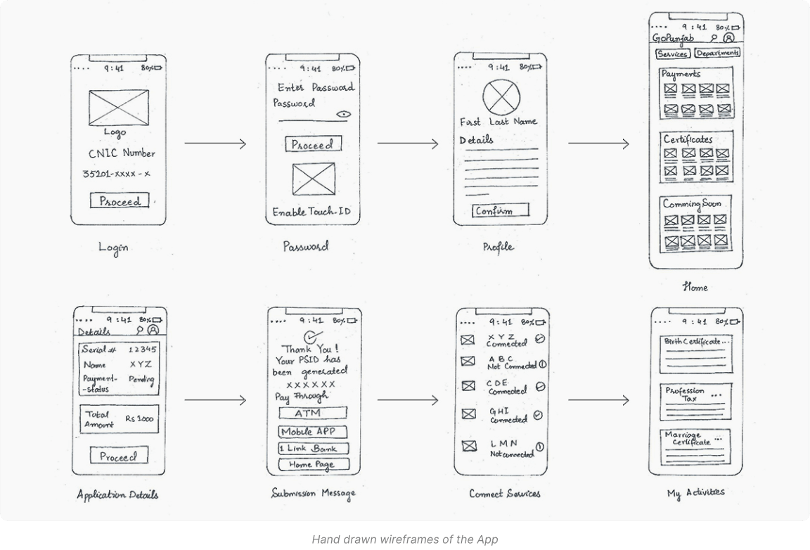
I sketched the low-fidelity wireframes of the app interface, using pen and paper, to visualize the layout, structure, and navigation of the app. I sketched multiple variations of the app screens, and compared and contrasted them to select the best ones.
The high-fidelity prototypes of the app interface included the following screens and features:
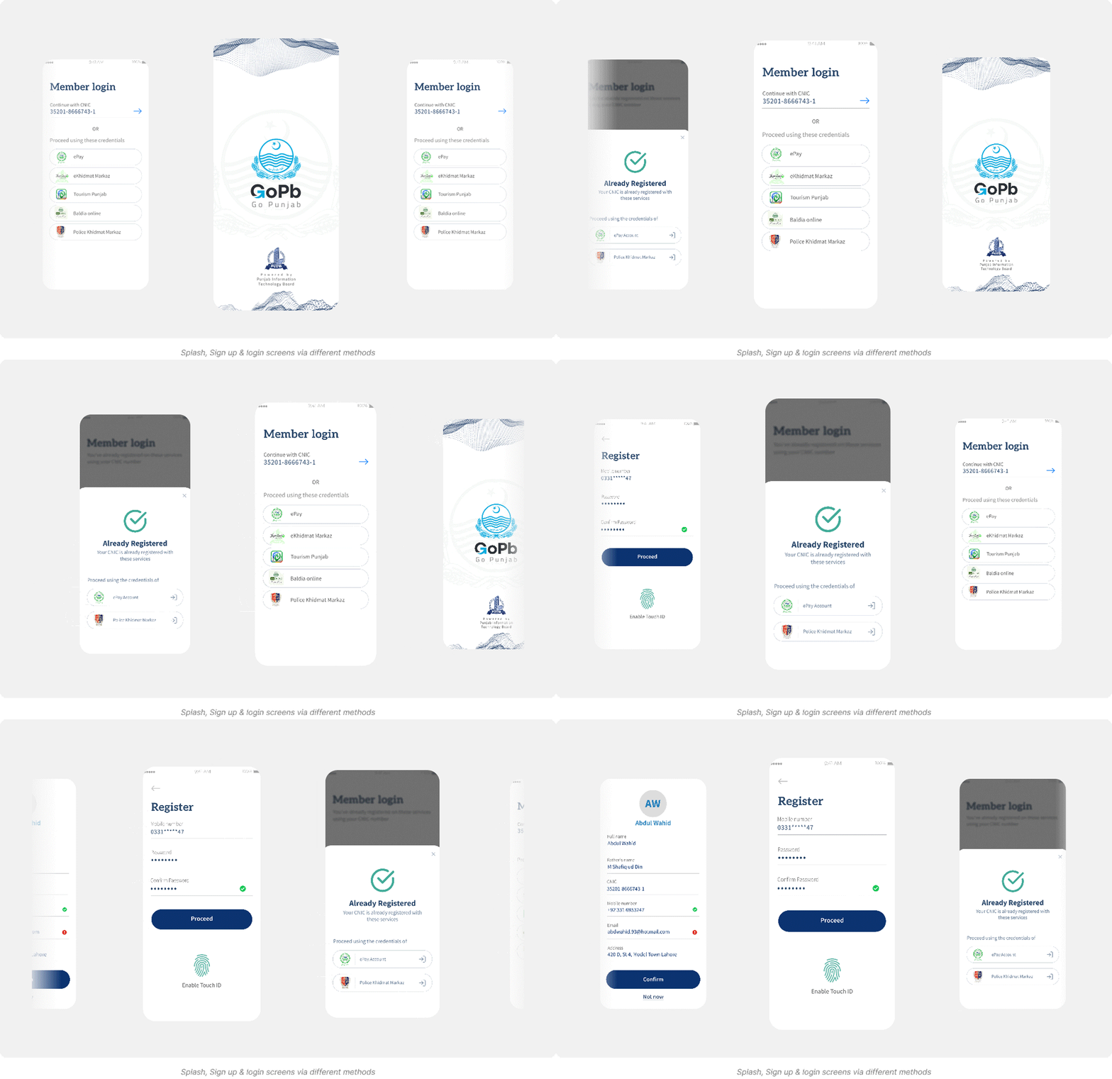
Splash & Login screens: This group contains the cards that represent the different types of services that the app offers, such as Payments, Certificates, Tourism, Travel & Transport, and Law & Order. The users explained that these cards belong to the same group because they are the main functions and features of the app, and they are the most important and frequently used by the users.
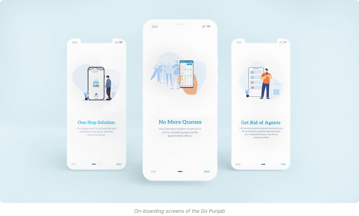
User Onboarding: The home screen displayed the main menu of the app, which included the services and departments tabs, as well as the search icon.
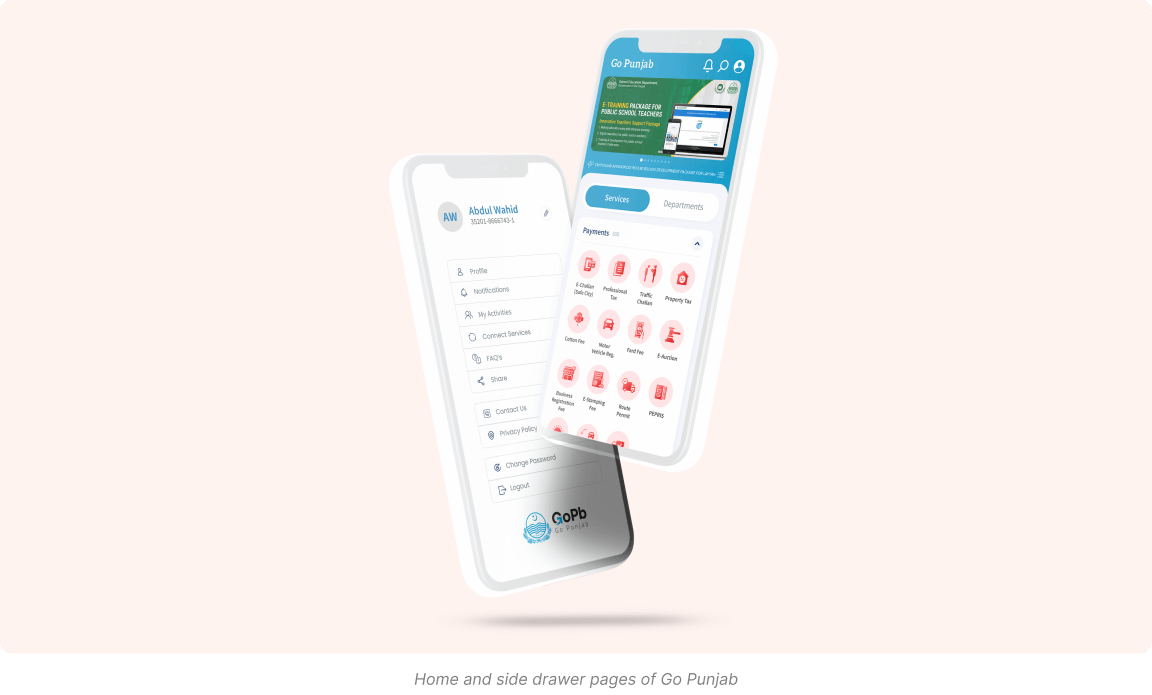
Home screen: The home screen displayed the main menu of the app, which included the services and departments tabs, as well as the search icon. The services tab showed the four categories of services: Payments, Certificates, Tourism, and Travel & Transport. The departments tab showed the list of government departments and agencies that offered the services. The user could tap on any service or department to access its details and functions.
Service Details: The service screen displayed the information and features of the selected service, such as the description, requirements, fees, application form, payment method, status, history, and receipt. The user could fill in the application form, pay the fees, submit the application, track the status, view the history, and download the receipt for the service.
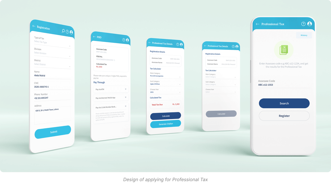
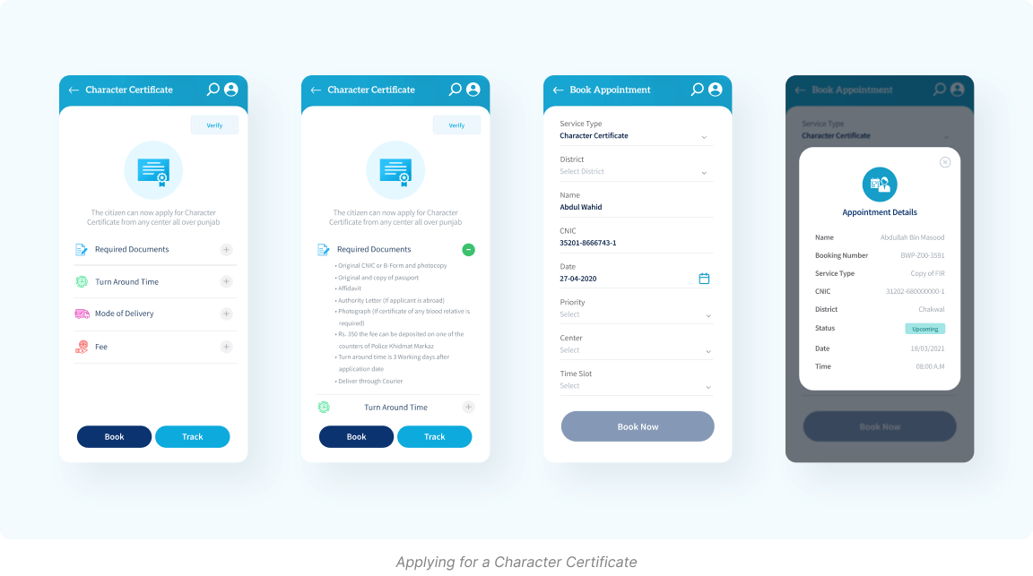
To test and validate the usability and accessibility of the app, I used various methods, such as:
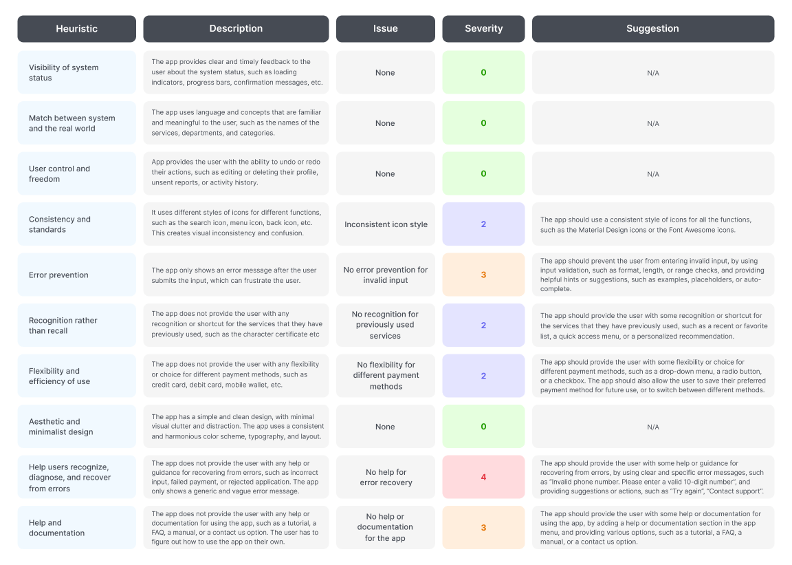
I conducted a heuristic evaluation of the app interface, using the Nielsen’s 10 usability heuristics, such as visibility, feedback, error prevention, etc. I identified and rated the usability issues and violations, and suggested the possible solutions and improvements. Here is the heuristic evaluation that I have created for the GoPb app:
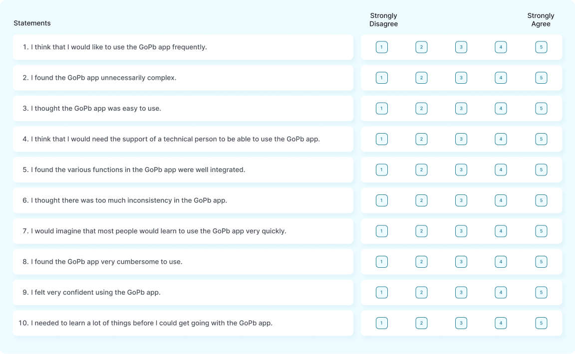
I conducted user testing sessions with 10 users who represented the target audience of the app. I asked them to perform various tasks and scenarios using the app prototype, and observed their behavior, actions, and reactions. I used the think-aloud protocol, and the screen-recording tool to capture the user data and feedback. I also asked them to fill in the SUS (System Usability Scale) questionnaire to measure their satisfaction and perception of the app usability.
Designing and developing the app wasn’t without its fair share of challenges, some of which were:
Integrating different web portals, services, and platforms with different databases, APIs, and architectures.
Obtaining permission and cooperation of departments and agencies for adding their services and ensuring data protection.
Designing the app interface for both English and Urdu languages, and ensuring the readability, clarity, and consistency of the text and graphics.
Marketing and promoting the app to the potential users, and encouraging them to use the app instead of the existing or offline methods of accessing public services.
Key takeaways and lessons learned from the app design and development process are as follows:
User research and user-centered design are important to make the app for the user and their needs and problems.
Prototyping and testing are important to improve the app usability and accessibility, and the app design and function.